Choosing The Right Lettering For Signs
Choosing the lettering for your business signs is something that you should not rush. The font and lettering that you choose will tell potential customers a lot about your business. Your sign is the first impression that you make on people and you want to ensure that you are making the best impression possible by using the right lettering.
Serif Fonts
The most common fonts that we use today are the serif fonts. They are easy to read when you have large amounts of text and have been used extensively in publishing. Times New Roman is the most commonly known serif lettering and is still used today for publishing and in schools.
Serif lettering will have a small angled line which projects from the upper and lower ends of the letters. This protraction is actually known as a serif and is why this type of font bears this name. While serif lettering is common and popular, you should not look at using it for your business sign. This lettering is best when you have a lot of text because it is easy to read.
.
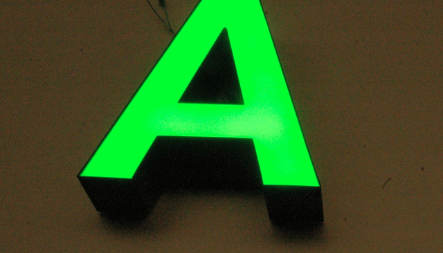
San Serif Fonts
San serif letting will be a better choice when you are looking at a building sign design. This is due to the fact that most directional street signs will use this lettering. This letting is easy to read when it is large and when there are few words. This makes it ideal for business signs where you will only have your business name.
San serif letting gets its name from the French word sans which means without. This lettering does not have the serif that is present in serif fonts such as Times New Roman. There are many different lettering styles that are sans serif with the most common being Helvetica Neue which comes in a range of sizes and weights.
Script And Cursive Lettering
A lot of businesses think that the use of cursive and script letting will make them stand out. While this is true to a certain extent, this type of lettering should be used with care when dealing with business signs. This is due to the fact that this lettering can be difficult to read and will not be easily absorbed by potential customers who are walking by your business.
Script and cursive lettering will generally be used on place cards and invitations to mirror them being handwritten. There are many different script and cursive lettering options available, but they should not be used for your business sign.
Novelty Lettering
Novelty lettering can either be charming or they can be annoying. This will depend on the type of lettering that is being used and how they are being used. If you are going to use novelty lettering for your business sign, you need to be careful.
If you are thinking about using this type of lettering, you should consider them for certain promotions or times of year and not for your primary business sign. Halloween signs with novelty lettering often work well, but only when the sign is large and does not have a lot of lettering on it. Novelty lettering will generally be hard to read which is why you should only use it on large and simple signs.
Combining Upper And Lowercase Lettering
There are many businesses that believe using only uppercase or lowercase lettering will be the best for their signs. This could be a mistake and you should generally look at combining upper and lowercase lettering. This is due to the fact that people are used to seeing this combination and the lettering will be retained faster.
If you are going to use only uppercase lettering, you should only do this for signs that have three words or less. If you have longer signs with only uppercase lettering, it will make people feel that you are shouting at them with the sign. This is due to the fact that writing in only uppercase online is the same as yelling at someone.
Additionally, you should be careful with only using lowercase lettering. This could make people think that the sign was completed incorrectly because uppercase lettering is always used at the start of a sentence. There are some instances when this lettering will work and businesses that target children will generally be able to use only lowercase lettering in their signs because of the child-like appeal of this.
When it comes to designing your business sign, you need to carefully consider the type of lettering that you use. You need to ensure that the lettering is easy to read and will give the right image of your business. There are certain fonts and lettering that you should stay away from when it comes to your business signs and novelty lettering should be used with caution.
Know about the benefits of lighted sign letters.in our next article.